TLDR: WATCH THE VIDEO (click above)
How can you tell when a company doesn’t measure their designers on behavior change?
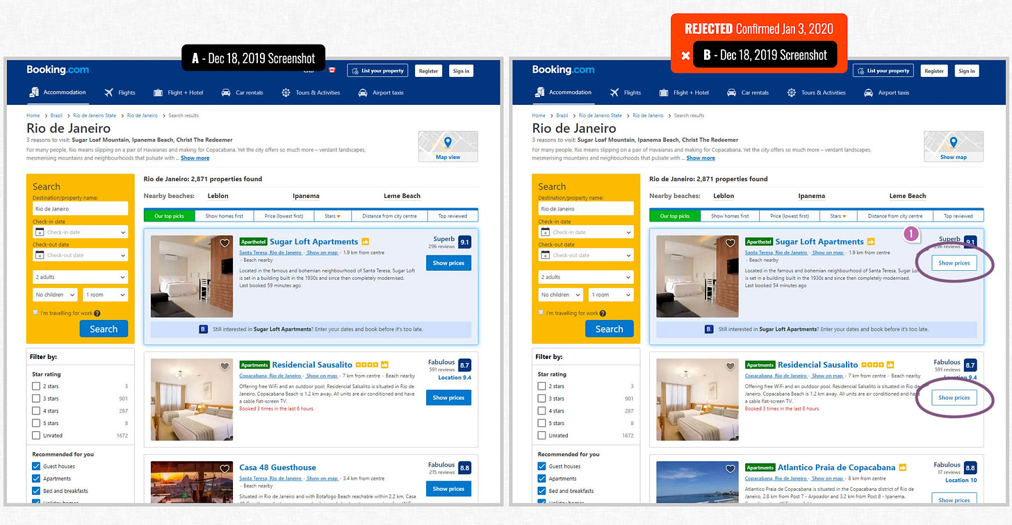
When you see (or don’t see) a ghost button.
If you’ve never seen one, it’s not your fault: these ghost buttons blend into their background, often featuring minimal contrast like white on white or gray on gray. They're aesthetically pleasing, but when it comes to user action, they might as well be invisible.
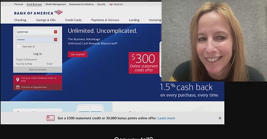
When applied to a platform like Bank of America's, where users navigate complex financial tasks, the cost of this elegance becomes clear. It's a textbook example of how design choices, however well-intentioned, can create barriers to action.

Make your website uglier
From a behavioral science viewpoint, every element on a website should serve a purpose in guiding users towards their desired behavior. This sometimes means making design tradeoffs that are aesthetically less pleasing.
Whether intentionally or unintentionally, if you replace high contrast buttons with ghost buttons, you’re making a strategic decision. And you will have lower user engagement and conversion rates.
Really, ghost buttons highlight a larger issue about the role of design in shaping user behavior. High contrast buttons are just the start. The larger mission should be to identify the behavior the user wants to accomplish and measure your design's success based on whether people do it. In the Irrational Labs 3B Framework, we call this the key behavior.
3 takeaways from this teardown:
1️⃣ Why you should make your website uglier
2️⃣ Why designers should be measured on behavior change
3️⃣ Why ghost buttons fail
Call to action for designers: I'd love to know how you balance aesthetics with performance. Have you encountered other design trends that compromise functionality, especially in critical applications like banking? Share them.
See you next week for another teardown. No ghosting. 👻
Have a friend who would enjoy these teardowns? Click the button below to refer them (& earn some great rewards)👇
Questions about your product? Email kristen@irrationallabs.com.
Want to increase conversion, retention, engagement? Reach out to Irrational Labs.
We design products that change behavior, using behavioral science. Check out our case studies to see it in action.


Share this post